Overview
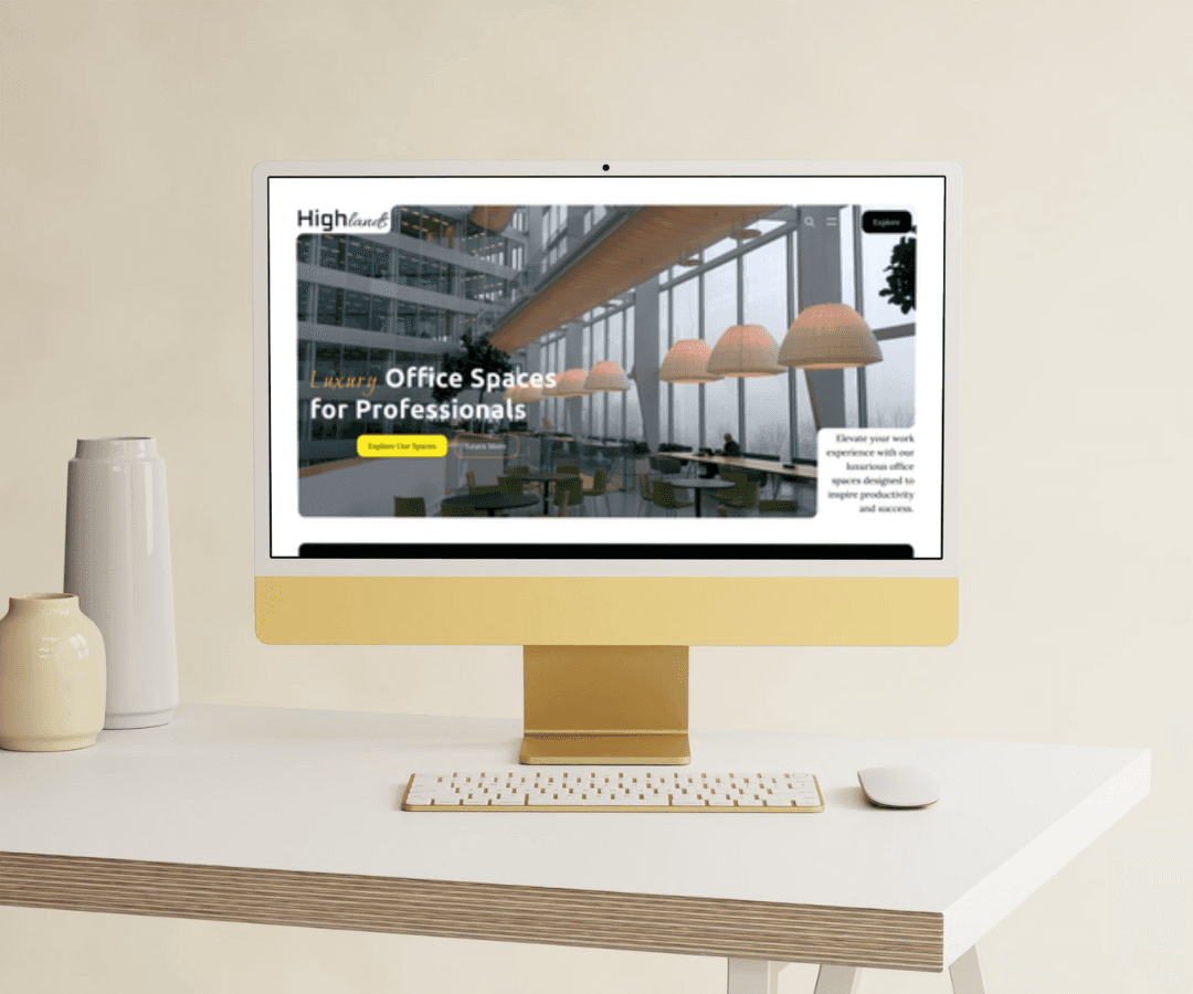
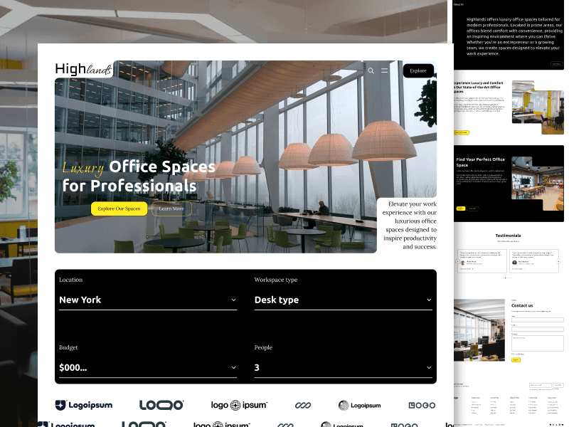
The Highlands landing page is a user-centric design for a platform offering luxury office spaces tailored to professionals. The design effectively targets users seeking modern, comfortable, and inspiring work environments by presenting essential information in a visually engaging and streamlined format.
Design Goals
Professional Aesthetic: Convey a sense of luxury, professionalism, and modernity.
Ease of Navigation: Simplify the user journey with clear pathways to explore options, learn about the company, and contact for inquiries.
Highlight Key Features: Emphasize the high-end amenities and prime locations that set these office spaces apart.
Encourage Interaction: Use intuitive design elements to engage users and encourage them to explore spaces, read testimonials, and contact the business.
Key Sections and Design Elements
1. Hero Section
Visual Impact: A full-width hero image showcases a modern office interior, instantly setting a luxurious tone.
Headline and Subheadline: Bold, clear messaging - "Luxury Office Spaces for Professionals" - immediately communicates the offering.
Primary CTA (Call to Action): The button "Explore Our Spaces" in yellow stands out against the darker background, inviting users to take immediate action.
Secondary CTA (More Info): A smaller "Learn More" button below provides an additional option for users interested in deeper exploration.
2. Filter/Search Section
Functionality: Drop-down filters for location, workspace type, budget, and people count provide users a way to quickly customize their search based on needs.
User Control: This section adds a functional layer to the homepage, making it easy for users to narrow down their options.
3. Client Logos
Social Proof: Displaying logos of well-known companies helps build trust and credibility, suggesting that reputable clients have chosen Highlands.
Minimal Design: The monochromatic logos fit the overall design aesthetic without overpowering the page’s main focus.
4. About Us Section
Informational Content: A brief overview of Highlands’ mission and values, focusing on the company’s dedication to comfort, convenience, and inspiring environments.
CTA (Learn More): A secondary CTA in this section allows users to dive deeper into the company’s story if they choose, contributing to an authentic brand image.
5. Feature Sections
Visual Hierarchy: Features are divided into separate sections with distinct images, headlines, and descriptive text to highlight the benefits of choosing Highlands' office spaces.
Images for Visual Appeal: High-quality photos of office interiors add a visual representation, enhancing the appeal of luxury and comfort.
Multiple CTAs: Each feature section includes buttons like "Explore" and "Learn More," allowing users to navigate based on their interest.
6. Testimonials
User Reviews: Rotating testimonials add authenticity, letting potential clients see feedback from other customers.
Personal Touch: Each testimonial includes a photo, name, and position, creating a more relatable and trustworthy feel.
Slider Design: A sliding carousel format keeps this section concise while showcasing multiple reviews.
7. Contact Us Section
Engagement Opportunity: A straightforward contact form encourages inquiries and communication, making it easy for users to get in touch.
Design Consistency: The form layout is simple and easy to navigate, consistent with the rest of the page’s clean and minimalist style.
8. Footer
Comprehensive Links: Columns include links to essential pages like About Us, FAQs, and Legal Information.
Email Subscription: A subscription option helps engage visitors for future communications.
Social Media Integration: Social icons allow easy access to Highlands’ social channels, encouraging users to stay connected.
Design Choices
Color Scheme
Black and White with Yellow Accents: The primary black and white scheme with yellow accents maintains a modern and professional look, while the yellow highlights essential elements, drawing the user’s eye to key actions like CTAs.
Typography
Clear and Readable Fonts: The use of clean, readable fonts reinforces professionalism, ensuring that the content is easy to digest at a glance.
Image Selection
High-Quality Imagery: The selection of modern, well-lit office photos enhances the luxury feel of the page, helping users visualize themselves in such spaces.
Layout and Spacing
Generous White Space: The layout includes ample white space, giving the design an airy and spacious feel, which aligns with the brand’s premium positioning.
Consistent Structure: The consistent structure across sections improves readability and makes navigation straightforward.
Usability Considerations
Responsive Design: The layout should be optimized for various screen sizes, ensuring a seamless experience on mobile and desktop devices.
Accessible Navigation: The primary and secondary CTAs are designed for easy identification and access, aiding users in their journey through the site.
Quick Contact Options: A prominent contact section with a clear form invites users to reach out, encouraging conversions.
Conclusion
The Highlands landing page is an effective design for a luxury office space provider. With a modern aesthetic, intuitive navigation, and engaging visuals, it successfully attracts professionals seeking high-quality work environments. The use of testimonials, client logos, and clear CTAs helps establish credibility and guide users toward exploring or contacting Highlands, supporting business goals.