Overview
The FitTrack app design aims to provide users with a sleek and engaging platform to monitor and achieve their fitness goals. The app offers workout tracking, personalized progress metrics, and a user-friendly interface.
Key Features
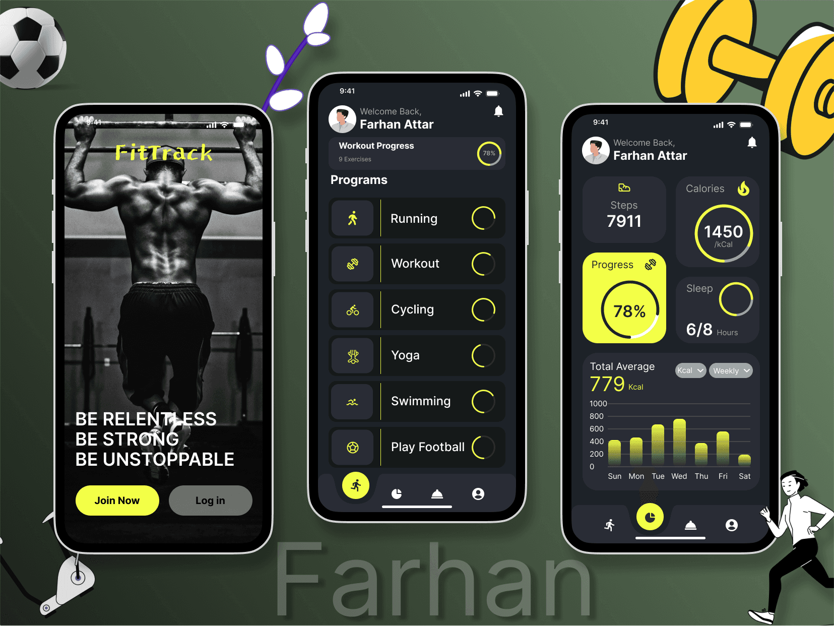
Splash Screen (First Screen):
Imagery: A motivational fitness image inspires users to take charge of their health.
Typography: Bold tagline, “BE RELENTLESS, BE STRONG, BE UNSTOPPABLE,” creates an emotional connection.
Call-to-Action (CTA):
Join Now (primary CTA in yellow) encourages new user signups.
Log In (secondary CTA in gray) caters to existing users.
Workout Dashboard (Middle Screen):
Personalization: Displays the user's name, welcoming them to the app.
Program List:
Includes activities like Running, Cycling, Yoga, Swimming, etc.
Progress bars next to each activity visually indicate completion rates.
Icons: Minimal and intuitive icons enhance usability.
Analytics Screen (Right Screen):
Key Metrics: Tracks steps, calories, and sleep hours in real-time.
Progress Visualization:
Circular progress bar for overall goal completion.
Weekly calorie bar chart for detailed insights.
Navigation Bar:
Bottom tabs with clear icons allow seamless access to other app features.
Visual Design
Color Palette:
Primary Colors: Neon yellow for highlights and CTAs ensures high visibility.
Secondary Colors: Dark gray and black dominate the background, creating a sleek and modern look.
Accent: White text ensures readability.
Typography:
Bold fonts for headings emphasize importance.
Subtle, clean fonts for body text enhance clarity.
Imagery and Graphics:
Fitness-themed images and vector illustrations add personality.
Dumbbell, soccer ball, and character elements convey activity and motion.
User Experience (UX) Highlights
Intuitive Navigation:
Clear hierarchy with CTAs and menus makes the app easy to explore.
Minimalist layout avoids clutter, focusing on essential details.
Engagement:
Real-time data visualization (progress bars, charts) keeps users motivated.
Personalized welcome screen fosters a sense of connection.
Accessibility:
High-contrast design supports readability.
Touch-friendly buttons improve usability across devices.